Mail.ru Group rebranding into VK
We are now VK
Over 90% of Internet users in Russia communicate using social networks, order food and a taxi, exchange emails, listen to music, read, learn and master new skills, play games, and solve their problems with more than 100 products in our ecosystem. Market analysts and professionals know us as Mail.ru Group. For users, the connection between our projects was not always obvious — it is time to change that.
Introducing VK: the new united company
“VK is a single brand for the whole company. As opposed to Mail.ru Group, it will be used not only at the corporate level but also in our products, as its users were not always aware of their connection with each other. For nearly a quarter of a century, we have been uniting technologies for people and people around technologies. The company’s single brand will highlight all options our ecosystem offers: communication and games, education (from school to professional), delivery of medicines and groceries, taxi, car sharing and online shopping, all solutions for business — from small to large — and much more,” VK CEO Boris Dobrodeev said.
VK becomes a single user and corporate brand for our entire company. The name VKontakte will be kept as a product brand for the social network.
The VK brand will be noticeable to users of every project: some products will be renamed, the brand will be associated with the rest through the logo and communications.
All projects will be connected through single services that make life more convenient — VK ID, VK Pay, VK Combo, and others.

How the names of our projects and products will change
The company's previous brand was corporate: we used it only in industry communities. For example, in communications with market experts and journalists. VK is a single company brand for users, teams, investors, and partners.
There are two options for using the new brand in our products. We conducted research together with our users and found out which projects would benefit from changing their identity and logo, and which should keep their own brand and link it to VK.
Some projects and services have already received or will receive the VK prefix in the name and unified logos. Here are some of them: VK Music (former Boom), VK Jobs (former Worki), VK Classifieds (former Youla), VK Dating (former Lovina)
The changes will take time, and the rebranding of projects will be gradual. For example, the Youla service will be renamed to become VK Classifieds in 2022. It will be presented both as a separate application and website and as a section within VKontakte. This will expand Youla’s audience and fully integrate social commerce into the product.
In addition to well-known user brands, the VK ecosystem offers more than 30 products for marketing, advertising, analytics, and other B2B areas. Some of them will receive new names in the near future — for example, VK Cloud Solutions. All agreements and contracts with partners and any other counterparties remain in force: changes in legal entities will happen later and will be technical. The managers will send out a notice in advance.
All new products of the company in the future will be created with the use of the VK brand. The decision to rename newly acquired projects will be made by the brand team based on analytics and research.
Leading projects in their segments with the most recognizable brands will retain it. They will also become an integral part of the VK ecosystem and will be linked to it by unified technologies, communications, and HR-brand, as well as the VK monogram on the logo.
 Odnoklassniki, VKontakte, and Mail.ru Mail are some of the strongest brands in the Russian segment of the Internet and an integral part of its development history.
MY.GAMES is our international brand. About 80% of our players are located abroad, so its logo will not change. We will continue to expand the user community of the unified ecosystem in overseas markets through MY.GAMES. At the same time, we plan to create the VK Games platform, closely integrated with social networks and focused on the Russian audience.
In order to determine the branding for each specific product, we conduct a series of studies and base our decision on data — therefore, not all projects have been finalized. Research and testing will continue. We plan to completely streamline all brands throughout 2022.
Why VK
The VKontakte brand is a perfect single brand for users: it is recognizable, future-oriented, and universal.
Recognizable: 100% of active Internet users know the brand.
Future-oriented: VKontakte ranks first in popularity among social networks with generation Z — young people aged 16 to 24.
Universal: VKontakte is a leading social network in Russia both in terms of audience and time spent by users: more than 1.1 billion minutes every day. People are already accustomed to using the social network to solve a variety of tasks: communicate in the messenger, listen to music, watch videos, play games, read news, order food or a taxi, study, shop, and others;
“We have conducted a variety of research and experiments and saw that the VK brand has a positive effect on people's desire to use almost any new product: for example, after we renamed Worki to VK Jobs, the service’s recognition increased by 37%, and the intention to use it - by 50%,” Vice President for Ecosystem Products Anna Artamonova noted.
All projects of the company will also become clearer and closer to users thanks to unified technologies and services: a single authorization VK ID, the VK Combo loyalty program, the VK Pay payment system, and the VK Mini Apps platform, which are already being implemented.
28 million users have logged in using VK ID outside of VKontakte in 2021.
Users have linked 20 million bank cards to VK Pay. More than 577,000 virtual VK Pay cards have been issued.
Over 4.5 million users of VK Combo subscription and music services save their money thanks to discounts and a loyalty program.
New VK identity
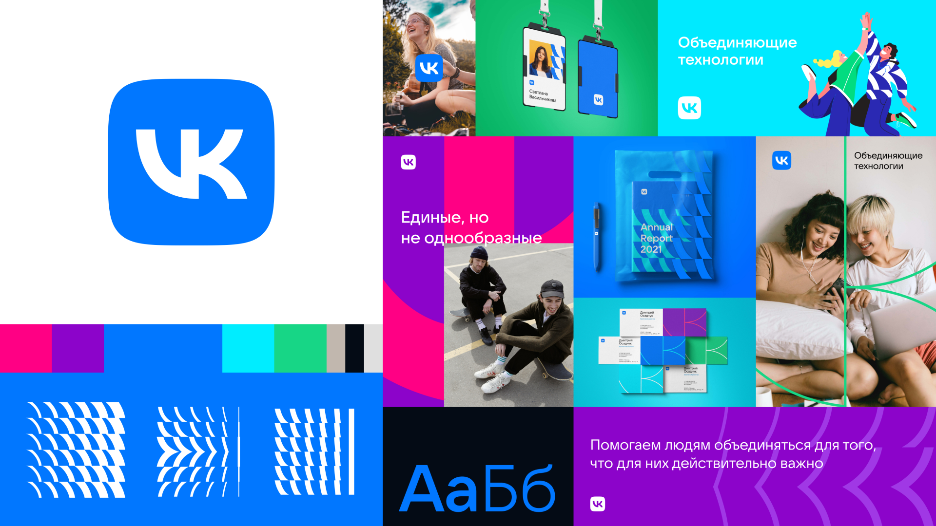
The VK logo was updated to become the base of the design system — it is now not only a symbol of the social network but also the brand logo for the entire company. The new monogram has become simpler, more geometric, and more balanced. In addition to the shape, the color has also been updated — the blue has become brighter and more noticeable.

“The monogram is our most recognizable symbol. It helps connect many products and emphasize their affiliation with VK. We have dropped the “beak” in the center (in order to put a bigger focus on its typography: now V and K, used as a base of the logo, can be seen more clearly. In addition, this makes the sign look cleaner even in small sizes,” VK Chief Brand Officer Violetta Silenina said.
We have also expanded the color palette – now we can use both strict and bright expressive colors. This technique will allow us to emphasize the expansion of the brand’s traditional space and show that VK is growing bigger. The use of additional colors will also help distinguish various projects within VK.
We are confident that we will be able to maintain visual identity even with the expansion of the color palette since the VK monogram and patterns created with it allow making layouts even without the corporate blue color. All VK communication will be issued under the corporate identity — external (for example, marketing campaigns and event announcements) and internal, designed for employees.
“Changing visual culture also leads to changes in internal culture. A unified brand implies closer collaboration — not among separate products, but as a common team. We can say that the visual component of rebranding is a symbol of our company’s evolution,” VK Creative Director Mitya Osadchuk said.
The company’s working group created the new architecture, positioning, and identity together with international consulting company Saffron Brand Consultants. Russian studio TypeType worked on the new logo and Tigers Moscow studio developed the corporate identity for the sub-brands.
Please find more materials here: https://cloud.mail.ru/public/X6kJ/imKn2Po11/
